A dull kitchen wall usually needs more than a brighter colour; it needs controlled contrast, a surface that responds well to light, and a focal point that fits the room’s working zones. By the end, you will know where to place an accent, how much wall to cover, and how to compare tile finishes, grout, and alternative wall treatments before ordering.
Key takeaways
- Use one focal wall zone instead of decorating every kitchen surface.
- Match tile size and direction to the kitchen’s shape.
- Balance decorative tiles with calm cabinets and simple grout.
- Compare samples beside cabinets, hardware and countertops before ordering.
How Highlighter Tiles Change a Flat, Dull Wall
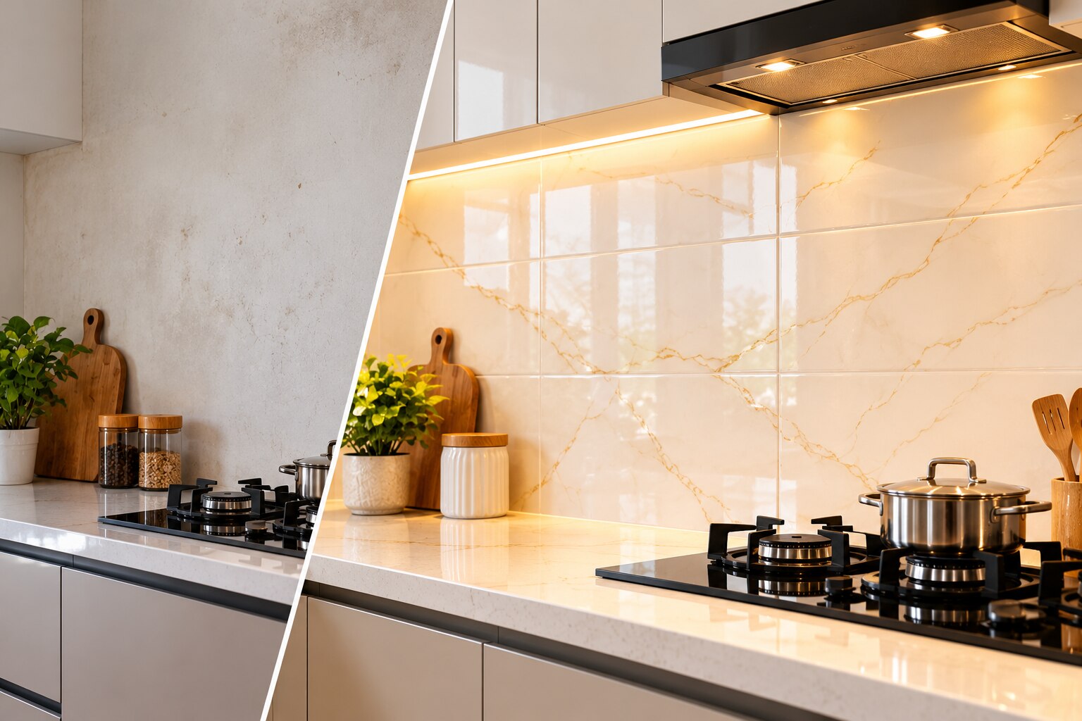
A dull wall becomes more useful visually when the tile creates contrast, direction and a clear focal point instead of covering every surface with decoration.
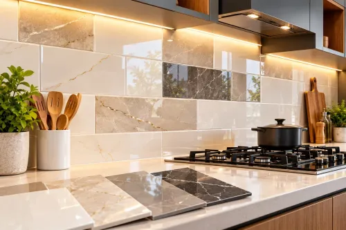
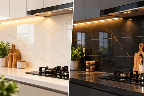
Highlighter kitchen tiles for dull kitchen walls draw the eye to a controlled area, such as the backsplash behind the hob, while a restrained field tile keeps the rest of the wall calm.
| Visual change | What your eye sees | Practical limit |
|---|---|---|
| Contrast in colour | A plain wall gains a strong focal point and clearer separation from cabinets or counters. | Covering the entire wall with a vivid pattern can make a small kitchen feel crowded. |
| Gloss and light reflection | Daylight and under-cabinet lighting bounce across the surface, making the wall appear brighter. | Gloss also reveals oil film, water marks, uneven grout and tile lippage. |
| Texture and relief | Shallow ridges or raised motifs add shadow, depth and a more tactile finish. | Deep grooves collect grease and take longer to wipe behind a hob. |
| Pattern and grout | Repeated shapes create rhythm; close-colour grout lets small modules merge into a quieter surface. | Contrasting grout outlines every tile and exposes small alignment errors. |
These changes work best when the accent has a visual job: framing open shelves, marking a sink zone or strengthening a breakfast-counter backdrop. Tiles for dull kitchen walls should be viewed in the actual room, because a catalogue image cannot show how their colour, gloss and grout respond to your lighting.
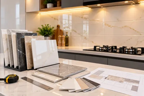
Make a physical mock-up before committing to the full wall.
Choose the Wall Zone Before Choosing the Pattern
The safest way to create impact is to reserve highlighter tiles for one deliberate wall zone and keep the surrounding surfaces quieter. A narrow backsplash behind the hob often delivers the strongest focal point without competing with cabinets, worktops, or open shelves.
| Location | Coverage pattern | Visual result and caution |
|---|---|---|
| Hob backsplash | Accent strip between the worktop and wall cabinets | Frames the cooking area; avoid deep grooves that trap grease |
| Sink wall | Short horizontal band or panel behind the sink | Adds colour without dominating; choose a surface that wipes clean |
| Breakfast counter | Vertical panel from worktop to shelf or ceiling | Connects the counter to the room; stop at a clear architectural edge |
| Dining-facing wall | One broad feature section | Works as a backdrop in an open-plan kitchen; keep nearby décor restrained |
| Full kitchen wall | Plain field tile with a smaller decorative inset | Gives continuity while preventing a small room from looking crowded |
Use accent kitchen wall tiles behind the hob when you want contrast to do the visual work. Use kitchen wall makeover tiles across a full wall only when cabinets, flooring, and hardware are already simple.
Match the accent zone to the wall’s boundaries rather than ending randomly beside a cabinet. A close grout colour merges small mosaics and softens pattern; contrasting grout outlines every piece and exposes uneven spacing. Tape a full-size mock-up to the wall before ordering.
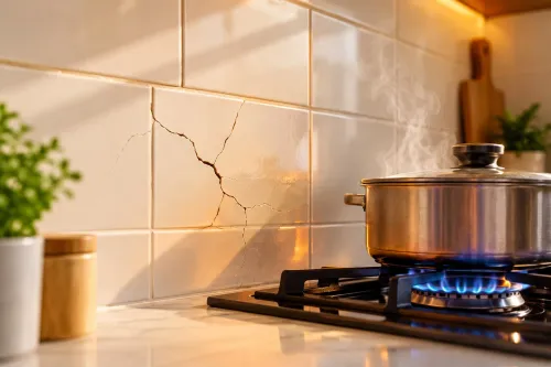
Inspect textured tiles at the cooking zone. Deep joints and porous or crackled surfaces need more cleaning than a shallow-relief or flat-glazed tile.
Match Tile Format, Finish and Colour to the Kitchen’s Shape
Use highlighter kitchen tiles for dull kitchen walls in a format that supports the room’s proportions, not simply the boldest pattern available. Small modules create more grout lines and visual activity; large rectangles calm the surface but need a reasonably flat wall.
| Kitchen shape | Tile format and pattern | Finish and colour | Why it works |
|---|---|---|---|
| Small | Medium rectangles or restrained mosaics; repeat one pattern | Light colours, satin or gloss, limited contrast | Reflects available light without making the wall look crowded |
| Dark | Larger tiles with subtle texture; avoid dense, small motifs | Gloss or softly reflective finish; pale, warm or clear colours | Bounces light and prevents deep texture from absorbing it |
| Narrow | Horizontal rectangular tiles or horizontal pattern flow | Light-to-medium intensity; avoid strong vertical stripes | Makes the wall feel wider rather than taller and tighter |
| Open-plan | Larger-format accent kitchen wall tiles with a controlled geometric or linear pattern | Matte texture for depth, or gloss where reflected light is useful; stronger colour is acceptable | Gives the kitchen a visual anchor without competing with nearby living areas |
For a compact kitchen, reserve the strongest pattern for the hob, sink, or breakfast-counter backdrop and use a calmer field tile around it. A physical mock-up reveals glare, texture shadows, grout contrast, and colour intensity more accurately than a catalogue image.
Before ordering, confirm the tile’s actual dimensions, thickness, wall-use suitability, finish, recommended joint, shade batch, and cleaning restrictions. A textured or metallic surface that looks effective can become difficult to degrease beside a hob.
Build a Calm Combination with Cabinets, Grout and Hardware
Use one accent zone and let a quiet field tile handle the remaining wall. A narrow strip behind the hob or sink keeps highlighter kitchen tiles for dull kitchen walls intentional; covering every surface can compete with cabinets, appliances and worktop patterns.
Coordinate each surrounding finish by giving it one clear job:
- Field tile: choose a plain or softly mottled tile that shares the accent’s undertone.
- Cabinets: pair patterned tiles with simple doors; use a restrained accent when the doors have strong grain, colour or moulding.
- Countertop: repeat one tile colour in the worktop, not the entire pattern.
- Flooring: keep it quieter than the wall so the eye does not have two competing focal points.
- Grout: match the field tile for a calm plane, then use the same grout or a close tone on the accent to avoid a grid effect.
- Hardware: select one metal family for handles, tap and lighting; a second finish adds clutter beside metallic or iridescent tile.
View the sample beside these finishes in daylight and under warm under-cabinet LEDs. Gloss, glass and metallic kitchen wall makeover tiles can shift dramatically between those conditions.
Before fitting, check every box for shade, calibre, batch, warpage and chipped edges. Correct a wavy wall before installing large-format tiles; levelling clips cannot cure a rocking substrate. Follow the maker’s joint width, because forcing a narrower gap can expose size variation and chip edges.
Choose shallow relief behind a hob so grease does not collect in hard-to-wipe recesses.
Compare the Tile Choice Before You Specify and Order
Compare the tile against the job, not just the sample. Paint costs less and is easy to refresh, but grease marks and steam show quickly. Wallpaper adds pattern without grout, yet peeling at joints or behind the hob can ruin the finish.
| Option | Check before buying | Main trade-off |
|---|---|---|
| Paint | Scrubbable finish and moisture resistance | Lowest disruption, least surface depth |
| Wallpaper | Kitchen-rated vinyl or washable surface | Fast pattern, vulnerable seams |
| Natural stone | Sealing, porosity and slab weight | Rich variation, higher maintenance |
| Large slab | Wall flatness, handling access and fixing system | Few joints, difficult installation |
| Glass | Toughened panel, heat tolerance and edge finish | Easy wiping, costly custom fitting |
| Plain ceramic or porcelain | Water absorption, size and available shades | Reliable base, limited visual contrast |
| Decorative tile | Body, glaze, finish and replacement stock | Strong accent, more cleaning joints |
For kitchen wall makeover tiles, check the tile body against wet exposure and ask for its ISO 13006 classification, water absorption, wall-use suitability and cleaning restrictions. A large-format piece exposes a wavy wall; levelling clips cannot correct an uneven substrate.
Ask the supplier to record:
- Nominal and actual size, thickness, edge type and recommended joint
- Pieces per box, coverage per box, batch, shade and calibre
- Replacement availability and the quantity from one batch
Inspect every box before fixing for chipped edges, warpage and shade changes. For decorative kitchen tiles in Pimpri Chinchwad, Shreya Marble can help compare these specification details with the plain field tile rather than judging from a showroom sample alone.
Related product
 | Kitchen Tiles Elevate Your Kitchen with Statement Style Highlighter tiles are the ultimate secret weapon for creating an impactful, custom-designed kitchen... View product → |
Frequently asked questions
How do highlighter tiles change a dull kitchen wall?
They add contrast, direction and a focal point, making a flat wall more visually useful without covering every surface in decoration.
Which kitchen wall zone should receive highlighter tiles?
Choose a clearly visible zone such as the backsplash behind the cooktop or sink, based on sightlines, splash exposure and the wall’s size.
How should you match tile format, finish and colour to the kitchen?
Use tile size and layout to support the kitchen’s shape, then select a finish and colour that work with its light, cabinets and countertop.
What should you compare before specifying and ordering tiles?
Compare physical samples with the cabinets, grout, countertop, hardware and lighting, and confirm quantities, dimensions and batch consistency before ordering.
Keywords